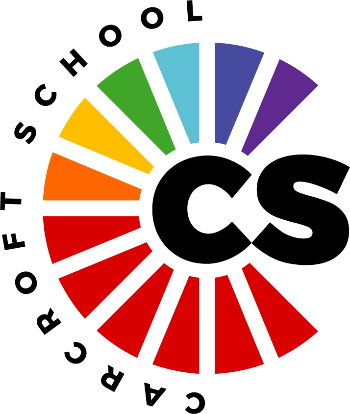
Last term we launched our new logo, however, we had a couple of queries from parents regarding the process and how we achieved the result in which we did. I shared with parents that I would ask the Graphic Designer whom we worked alongside to provide a little more insight into the design process, in order to clarify how we reached our final design as he has a much better understanding of this than I do, this is outlined below. I hope that this helps to further clarify the process for any parents who did have any queries.
Account from Ricky Elderkin, Graphic Designer at XP Trust.
The creation of the new logo was very much a professional, real world process and experience that we wanted to share with and include, as much as possible within the construct of the brief, everyone at Carcroft School.
After the participating students had drawn up their ideas, they chose a shortlist of five designs and handed them over to XP Trust Comms Crew to begin refining, developing and bringing to fruition.
It was extremely clear, from the concepts submitted, that there was a strong emphasis on community and unity, and what it means to be Crew, along with pride in both the regional and local industrial history that has shaped Carcroft.
Assets like the mining wheel and tools, and the pervasive use of rainbow colours, a defining characteristic of the pandemic response, and, coincidentally, the brand colours of XP Trust, were very present in the work. It spoke to us and gave us a clear conceptual angle to get behind, explore and develop.
With all the schools in the Trust working towards cleaner, simpler, more-synergised brand solutions, the miners wheel designs that the students submitted had immediate resonance, in terms of satisfying that criteria and being a potent, practical and universally-recognisable symbol.
By rotating the conventional, semi-circular representations of a miners wheel through 90 degrees to make the ‘C’ shape, and then colouring the spokes from single colour (red, black or white depending on application) up through the XP Trust rainbow colour spectrum, a simple, vibrant logo emerged that represents unity, positivity, progression and development within the school, the community and its legacy.
The concepts developed by XPT Comms were critiqued by the participating students and Expedition leads at each stage of submission. Their input/feedback informed the next phase of developments until we arrived at a final, chosen concept.
As I shared before the half term break, I, along with the other leaders really love the final design, in particular, I love the way in which it symbolises ‘Carcroft’, ‘Crew’ and ‘community’ all in one which was what we hoped to achieve as this was something that came through from the children’s designs.
We understand that we are not always going to be able to please everyone with something such as this, but I do hope that parents can see that we have tried to involve the children in the full process, in order to further develop their understanding of how this works in a real life context. In addition, hopefully, parents can see that the Graphic Designer has tried to capture all aspects of the children’s work whilst also making it work for the XP Suite of Logos too.
I would like to take this opportunity to thank Ricky, the Graphic Designer for taking the time to provide further detail regarding how the process works in order to provide parents with a little more clarity around the whole process.
I do hope that for those parents who voiced that they could not necessarily see the children’s work in the final design, that you can now possibly see that the children’s voice was very much at the heart of the whole process.
I can’t wait to see the new logo above our school doors when we open in September, as well as seeing the children in their red uniform with the logo on for those that choose to do so.
Thank you again for your continued support,
Miss Laing
Headteacher
